Inspire before showing everything.
Lead with editorial imagery and meaningful groupings, then provide depth as intent becomes specific.
Mobile product design · May 2024 to present
I redesigned LUJO's dining journey around premium discovery, meaningful filters, confident venue decisions and concierge support.
The challenge
The inherited experience looked dated and offered little help when members needed to narrow restaurant choices.
Dining intent is contextual. Cuisine, location, date, time, atmosphere and group needs all shape the decision. Yet the earlier experience had no meaningful filtering system and limited support for comparing a venue before requesting service.
Make exploration feel curated instead of overwhelming.
Provide useful controls without turning refinement into work.
Keep human concierge support visible when technology cannot complete the journey alone.
Process evidence
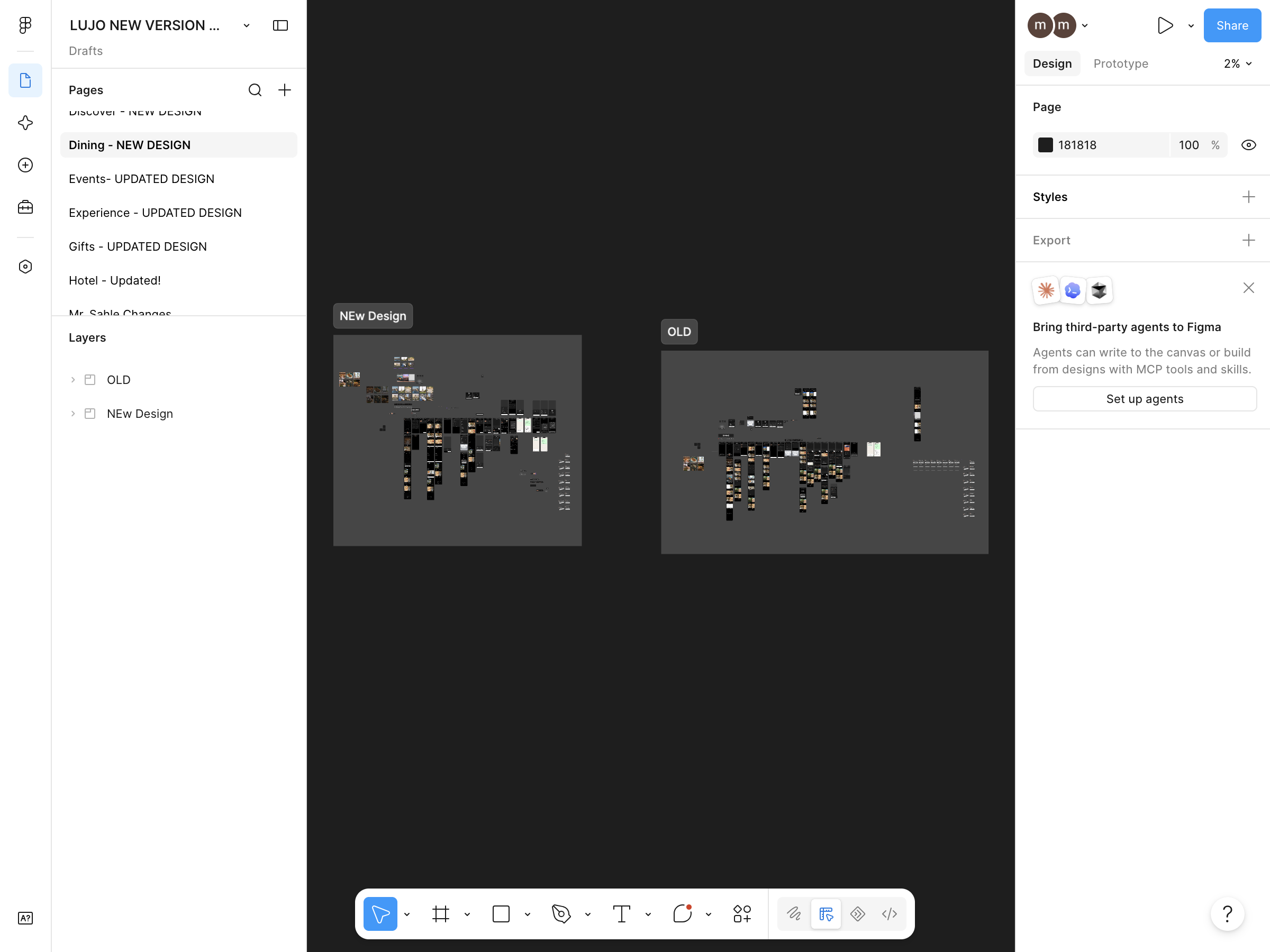
The supplied Figma file preserves explicit OLD and New Design areas. It records the scale of the work: a new discovery hierarchy, filter suite, details experience and request states.
My contribution
As sole product designer, I translated stakeholder direction into flows, high-fidelity screens, prototypes and reusable patterns.
I reviewed competitor apps and captured interface references to clarify patterns and stakeholder expectations. I iterated extensively in Figma, prepared handoff and worked with developers as the designs met real implementation constraints.
Convert CEO requirements and reference apps into a coherent product direction.
Rework navigation, hierarchy, filters, venue details and request states.
Support developer handoff, review implementation and prioritise usability when parity was limited.
Formal testing was completed by QA testers. I used their findings with stakeholder and developer feedback to refine the experience.
This case study does not claim formal generative user research. It distinguishes competitor-reference work, stakeholder input and QA validation clearly.
Design principles
Four rules helped the redesign remain useful while the visual direction became more premium.
Lead with editorial imagery and meaningful groupings, then provide depth as intent becomes specific.
Filters shorten a decision through clear language, visible selections and predictable apply or reset actions.
A structured concierge request should feel like a deliberate continuation, not a digital dead end.
Key solution
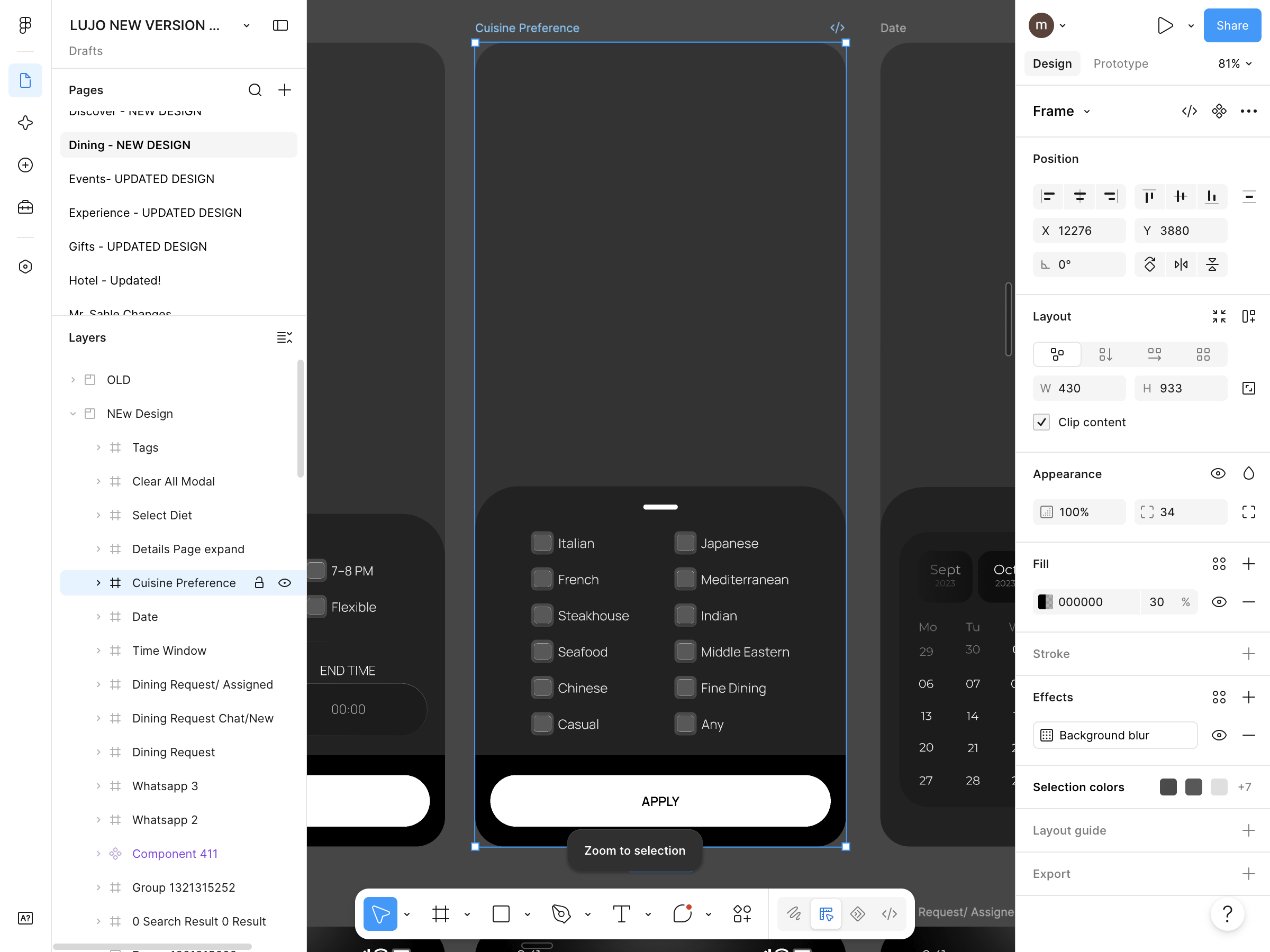
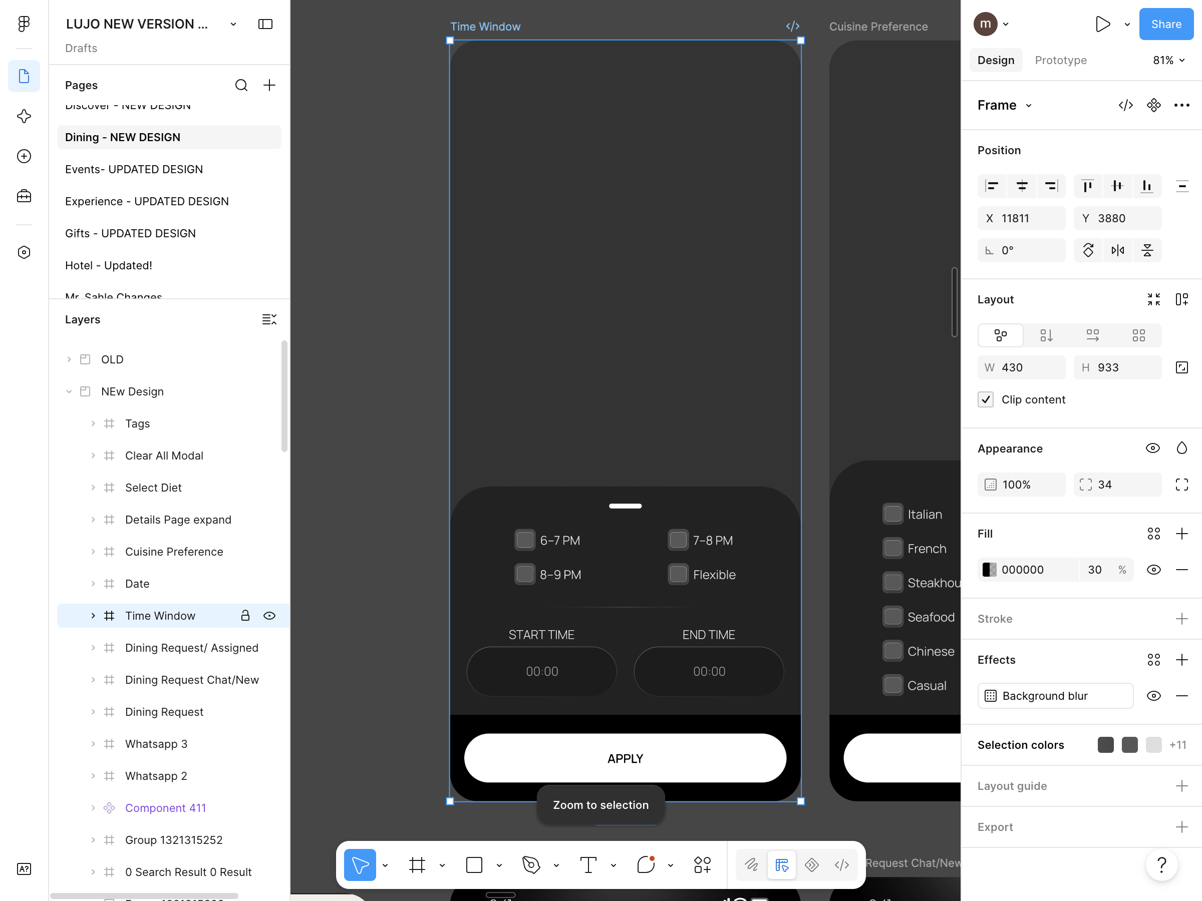
The redesign introduced refinements for dining preferences, cuisine, date and time. Visible selections help members understand the result set and remain in control.

Venue decision
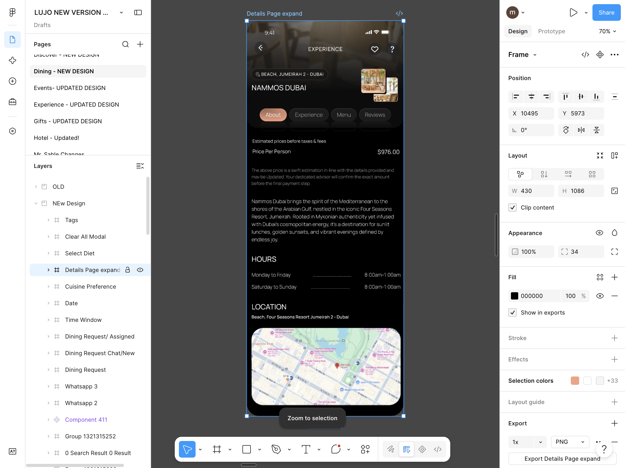
The venue experience organises editorial and practical information into About, Experience, Menu and Reviews.
Price, opening hours, map context and a clear service action remain available without competing with the character of the venue.
Concierge handoff
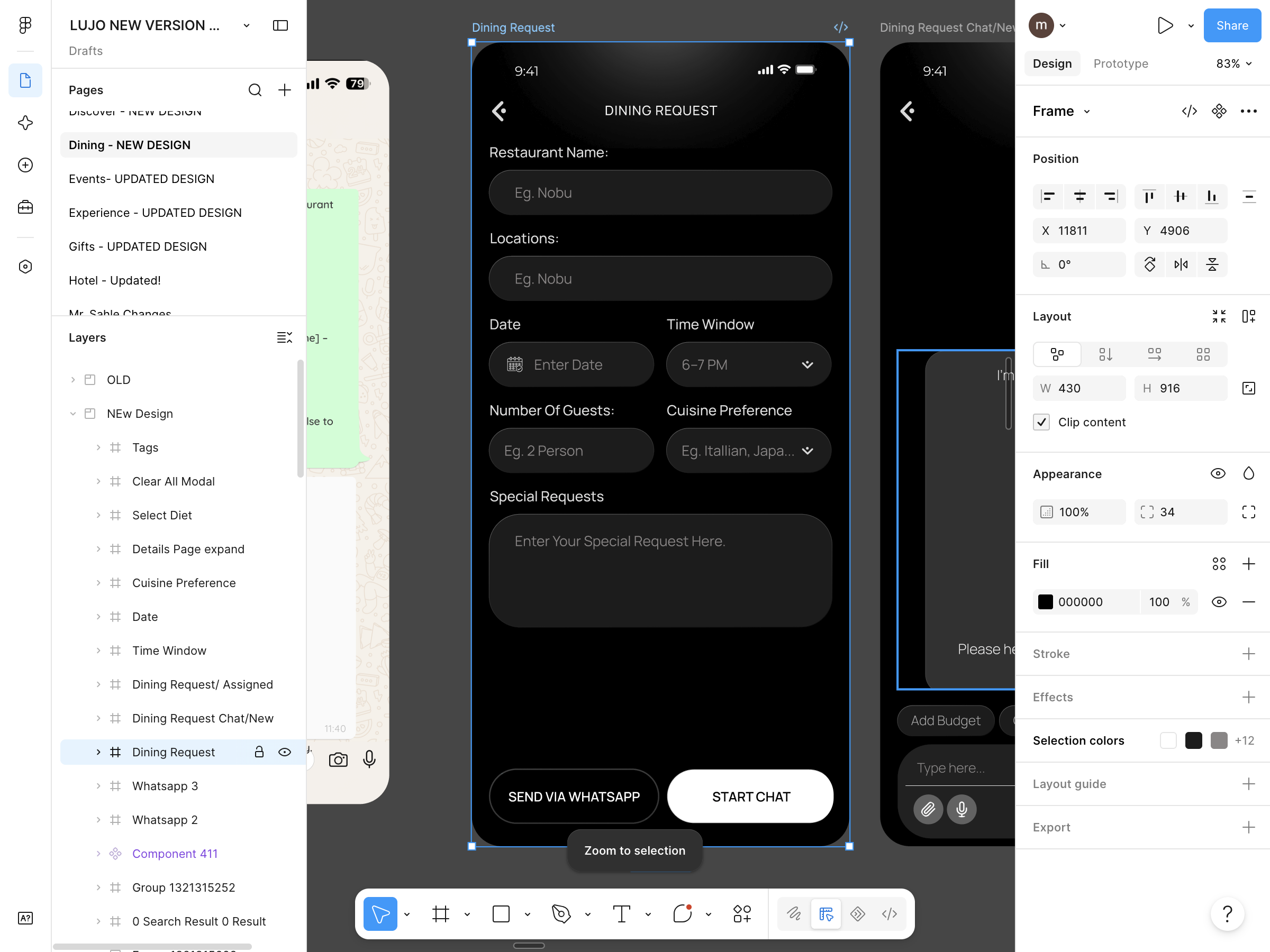
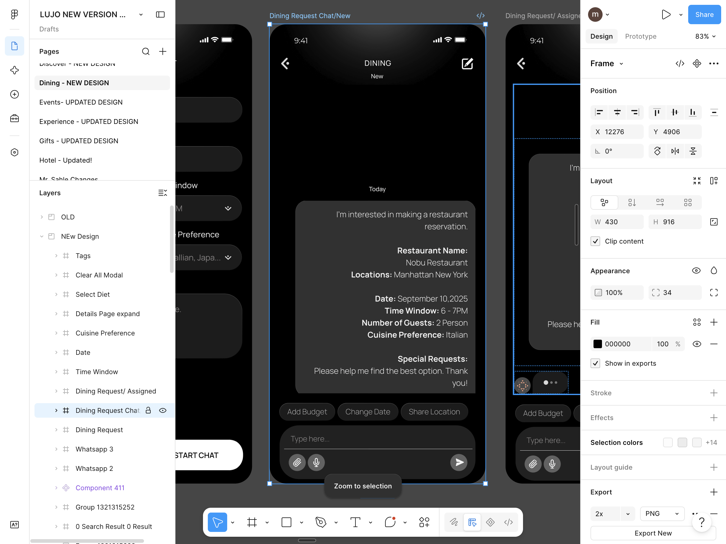
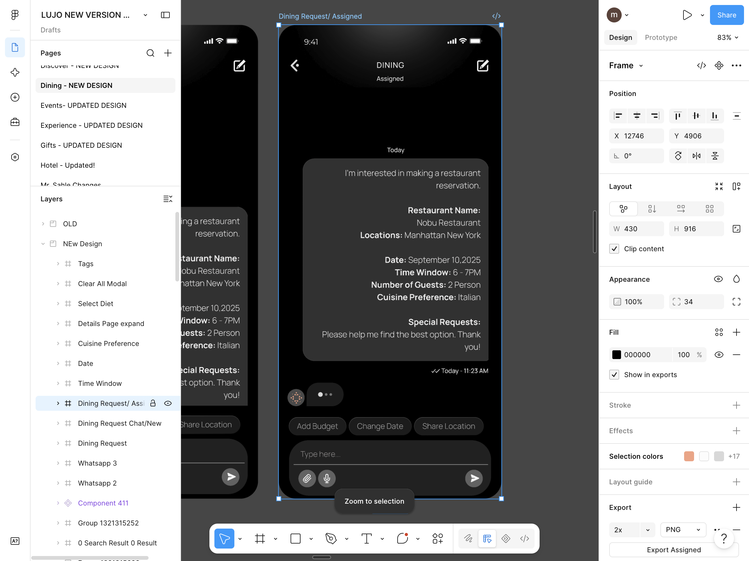
Restaurant, location, date, time, guest count, cuisine and special requirements become one readable request. New, chat and assigned states make the service handoff easier to follow.
Figma to release
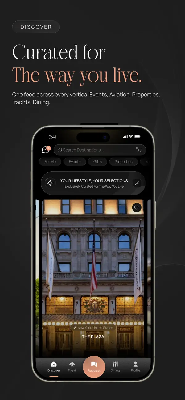
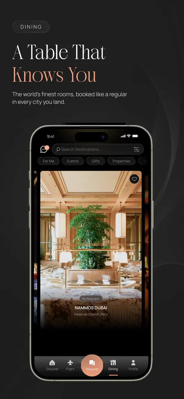
The public listing reflects the dark, image-led dining direction and visibly includes search, refinement, content cards, category pills and mobile navigation.
Luxury palette, editorial imagery, Dining identity, search and filter affordances are visible publicly.
Some Figma details changed because of implementation limitations. I documented gaps and prioritised usability.
The listing cannot prove complete interaction parity, accessibility states or detailed request behaviour.
Outcome
CEO-approved product direction.
First meaningful structured filtering experience.
Formal product testing completed by QA testers.
Design direction available publicly on iOS.
No conversion, satisfaction, retention or efficiency improvements are claimed because validated analytics were not available for this case study.
Reflection
This project reinforced that premium product design is not visual styling alone. It reduces uncertainty and makes the transition between self-service and human assistance feel coherent.