Lead with the spaces people recognise.
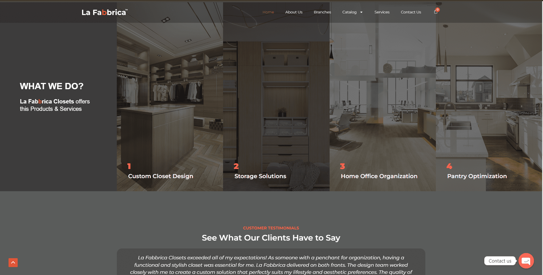
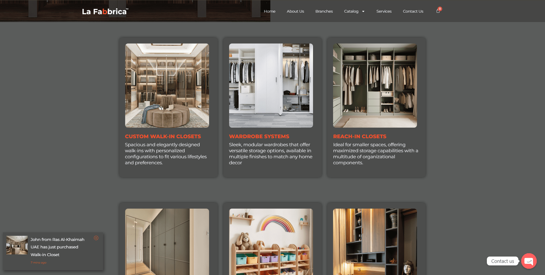
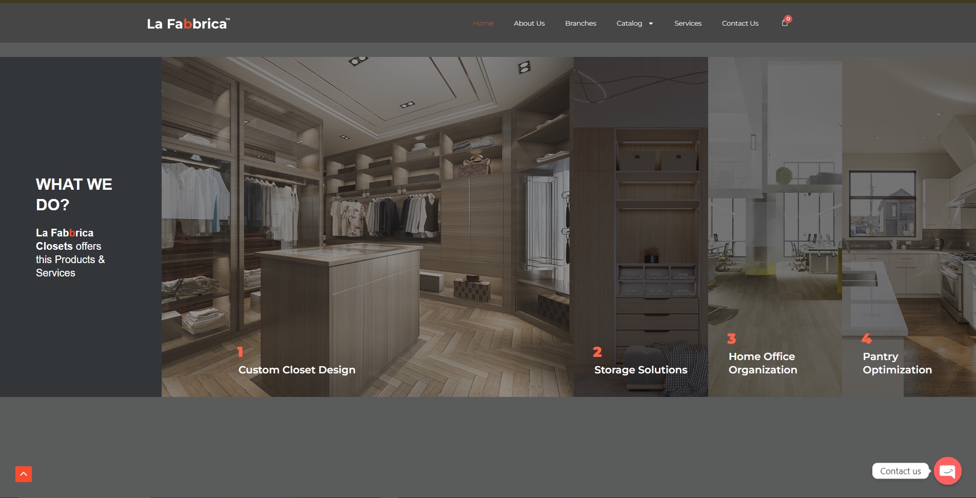
Product categories use familiar residential contexts, reducing the effort required to understand the offer.
Responsive website · 2024
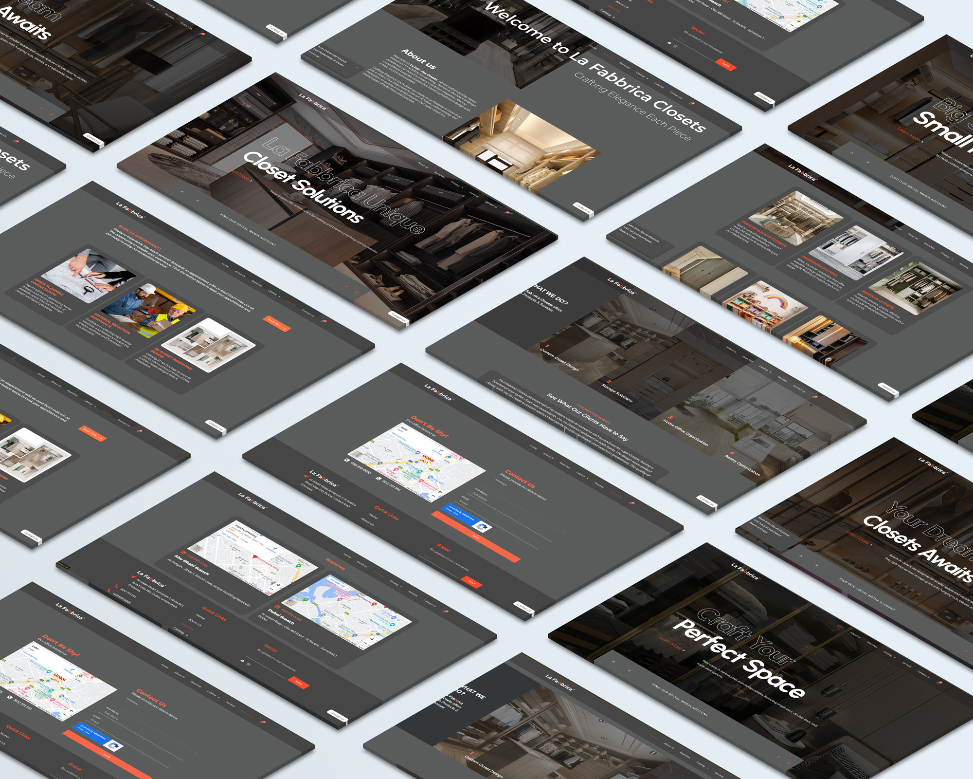
A complete website direction for a custom storage company, designed to turn a broad service catalogue into a clear path from inspiration to enquiry.
Problem
The company needed more than a digital brochure. Visitors had to understand the difference between custom closets, storage systems, offices and pantry solutions before they could make a useful enquiry.
I shaped the information hierarchy, page rhythm and visual treatment around large interior imagery, recognisable service categories and consistent access to contact.
Product categories use familiar residential contexts, reducing the effort required to understand the offer.
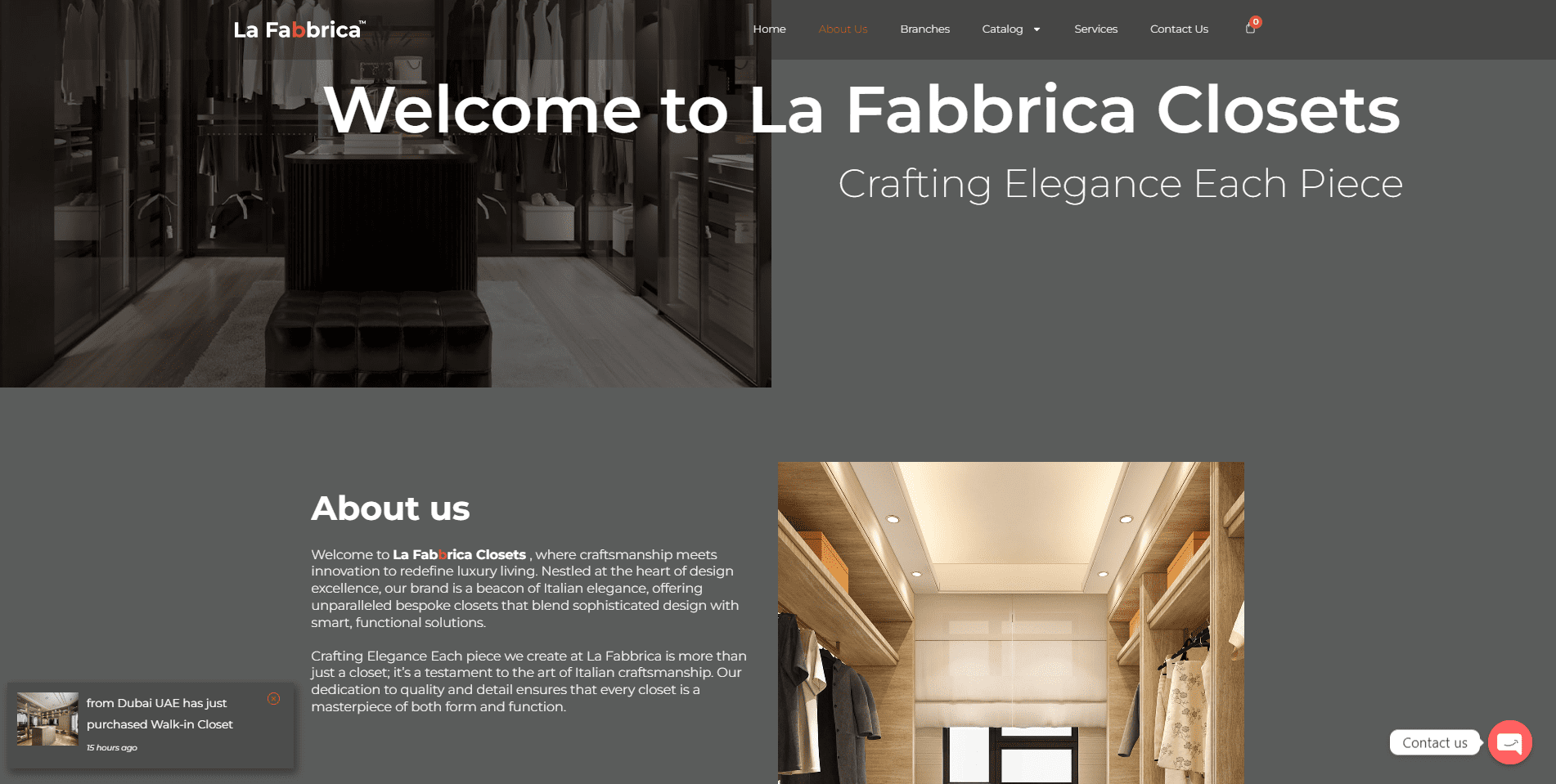
Editorial imagery creates interest while service pages carry the information needed to evaluate a solution.
Contact pathways remain easy to reach without interrupting the browsing experience.
Contribution
I treated the site as a guided sales conversation, not a collection of disconnected pages.
The work connected service architecture, image-led browsing, detailed product presentation and contact access across responsive layouts.
Group the offer around spaces and storage needs a prospective customer can recognise.
Build page hierarchy, reusable interface patterns and a restrained premium visual language.
Translate the direction into a responsive WordPress experience with consistent enquiry paths.
No lead or conversion uplift is claimed because validated website analytics were not supplied for this case study.
The dark neutral palette and restrained orange accent connect navigation, product categories, details and enquiry states while allowing interior photography to carry the emotion.
Delivered value
A clear service and collection hierarchy.
Responsive pages that retain visual continuity.
Direct contact access throughout the browsing journey.
The strongest decision was treating the site as preparation for an enquiry. Each page helps a prospective customer arrive with a clearer idea of the space and solution they need.