Multiple ways into the catalogue.
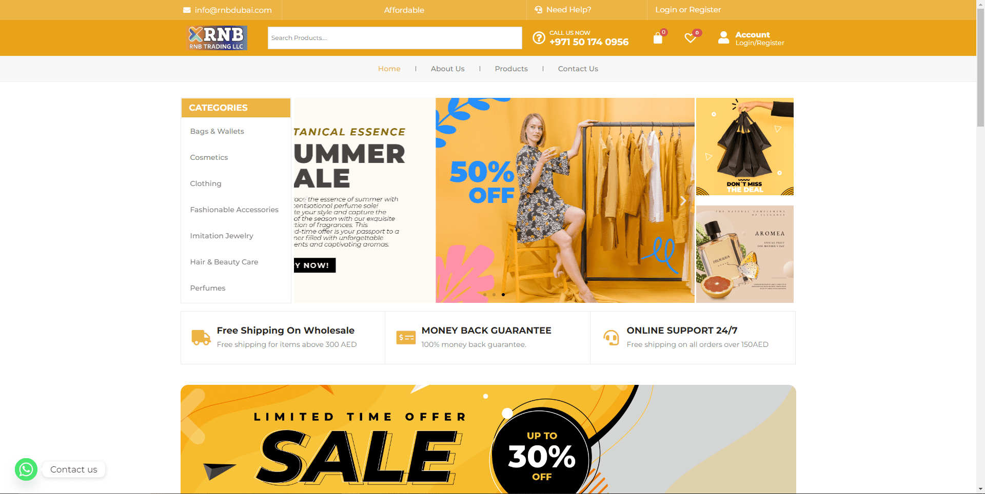
Search, categories and promotional groupings support shoppers with different levels of intent.
E-commerce website · 2024
An end-to-end retail system connecting discovery, catalogue browsing, product evaluation and the path toward purchase.
Problem
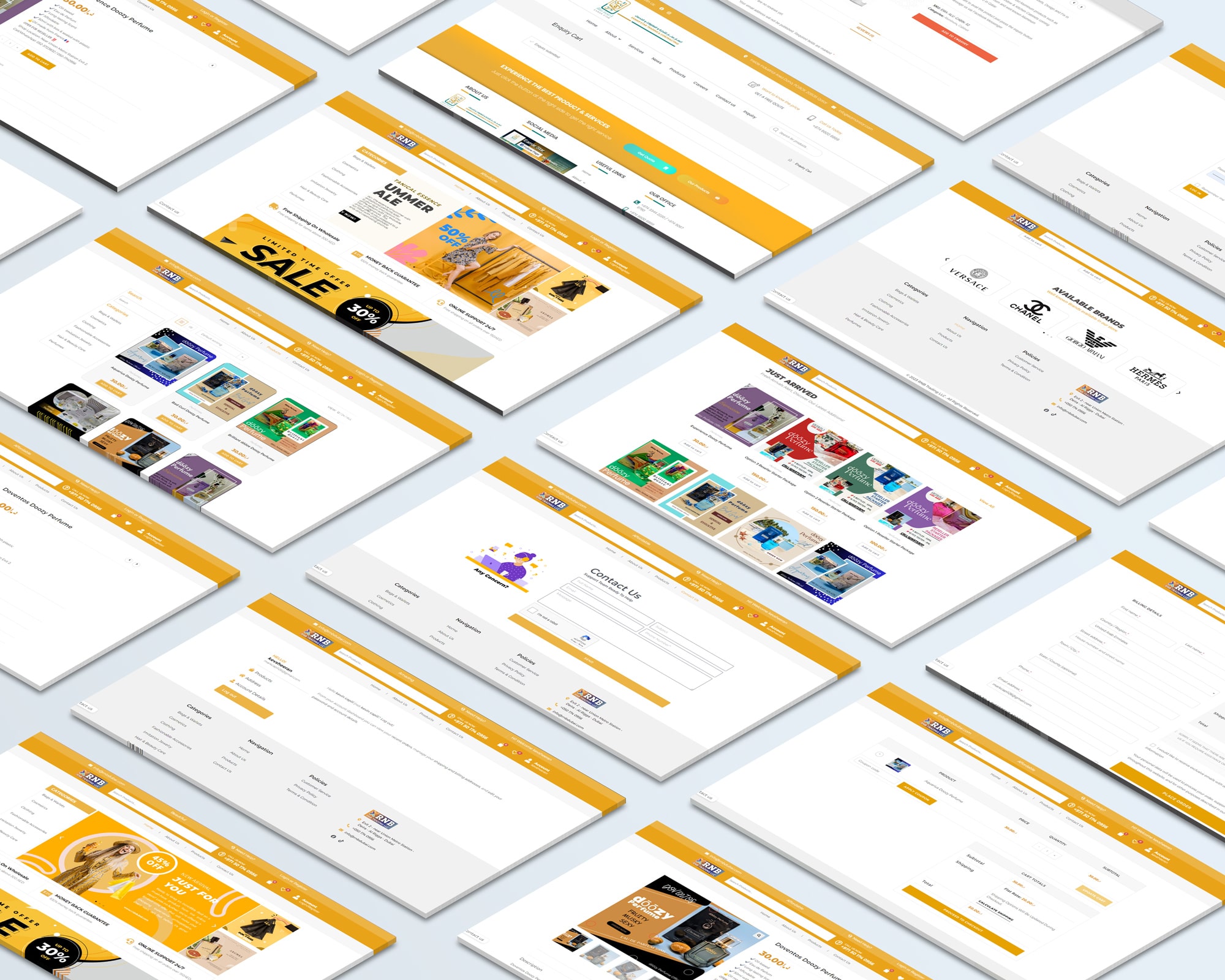
The work covers the connected states an online shop needs: category navigation, search, product grids, product details, cart, account and supporting service pages.
I used familiar commerce patterns so customers could concentrate on choosing products instead of learning a new interaction model.
Search, categories and promotional groupings support shoppers with different levels of intent.
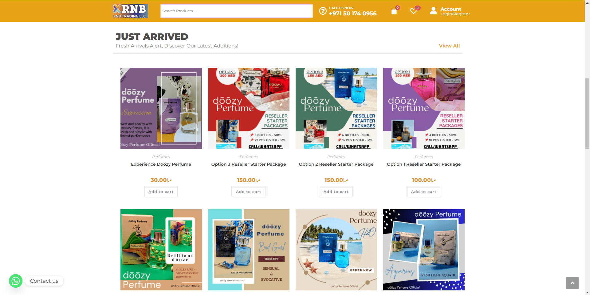
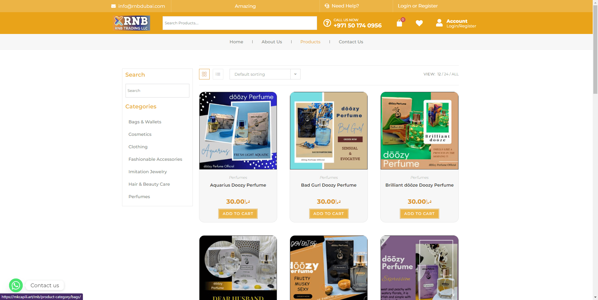
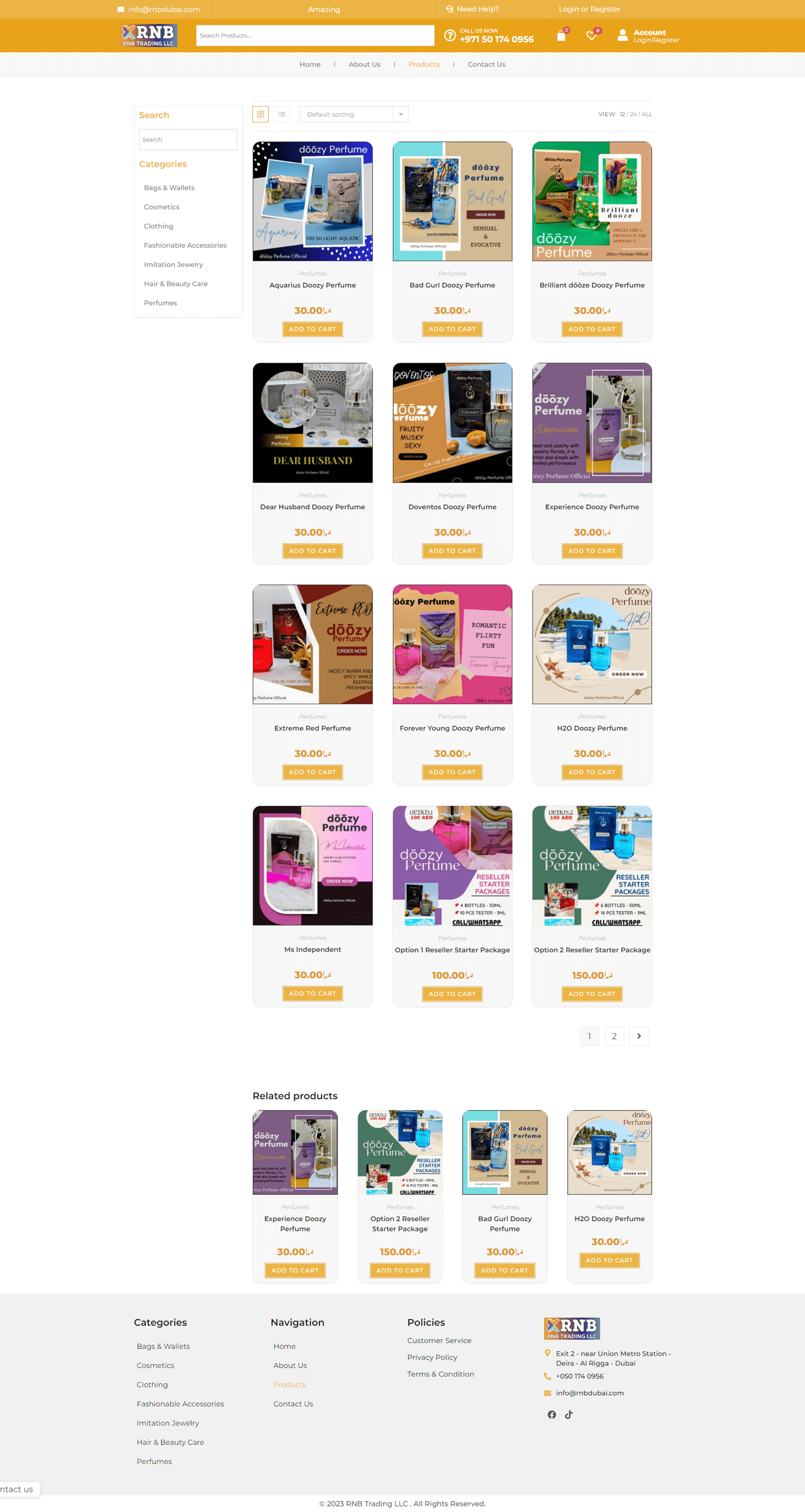
Cards use repeatable image, category, price and action patterns to support faster scanning.
Account, cart and checkout states stay connected to the same visual system.
Product thinking
The key design responsibility was continuity across different levels of shopper intent.
A campaign-led home page can create interest, but the system must still support catalogue scanning, product evaluation and expected transaction actions.
Connect promotion, navigation, search and category entry points.
Keep imagery, naming, price and product information predictable across the catalogue.
Maintain visible account, cart and purchase actions without crowding every screen.
Journey architecture
The structure follows the decisions a shopper needs to make. Each level adds detail without changing the basic interaction language.
Campaigns, search and categories support broad or specific intent.
Repeated image, name, category and price patterns reduce relearning.
Details, imagery and purchase actions move into a clearer hierarchy.
Account, cart and checkout follow familiar commerce behaviour.
Design tradeoffs
The store needed a recognisable brand without making routine shopping actions unfamiliar. I used brand expression in campaign imagery, colour and typography, then kept core commerce behaviour conventional.
Use expected search and category patterns instead of inventing a branded interaction model.
Keep product cards quiet and repeatable so comparison stays efficient.
Reserve the orange accent for navigation, selection and purchase priority.
Preserve information order as layouts collapse from desktop to mobile.
The available archive demonstrates the designed journey and interface system. It does not provide evidence of user testing, release parity, conversion uplift or sales impact.
The orange brand colour signals key navigation and purchase actions while a quieter layout gives product imagery and pricing enough room to work.
Delivered evidence
A connected home, catalogue and product-detail system.
Reusable navigation, product-card, price and action patterns.
A responsive commerce direction with documented interaction logic.
The project reinforced the value of convention. Search, price, categories and cart actions need strong hierarchy, but they should never compete for attention at the same moment.